 "El Relámpago(LZone) - Humanity First!" (lightningzone)
02/04/2016 at 07:11 • Filed to: None
 7
7
 5
5|
"El Relámpago(LZone) - Humanity First!" (lightningzone)
02/04/2016 at 07:11 • Filed to: None | 7
| 5 |
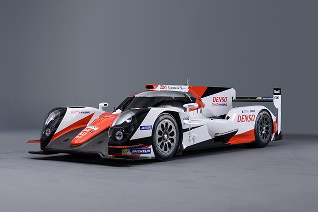
I think it looks pretty sick, even if it’s on last year’s car, and even if some people say that it looks too much like what Audi and Porsche use.
 dailydoseofmindlessness
> El Relámpago(LZone) - Humanity First!
dailydoseofmindlessness
> El Relámpago(LZone) - Humanity First!
02/04/2016 at 07:16 |
|
Keeping the corporate color scheme consistent.
 chaozbandit
> El Relámpago(LZone) - Humanity First!
chaozbandit
> El Relámpago(LZone) - Humanity First!
02/04/2016 at 07:21 |
|
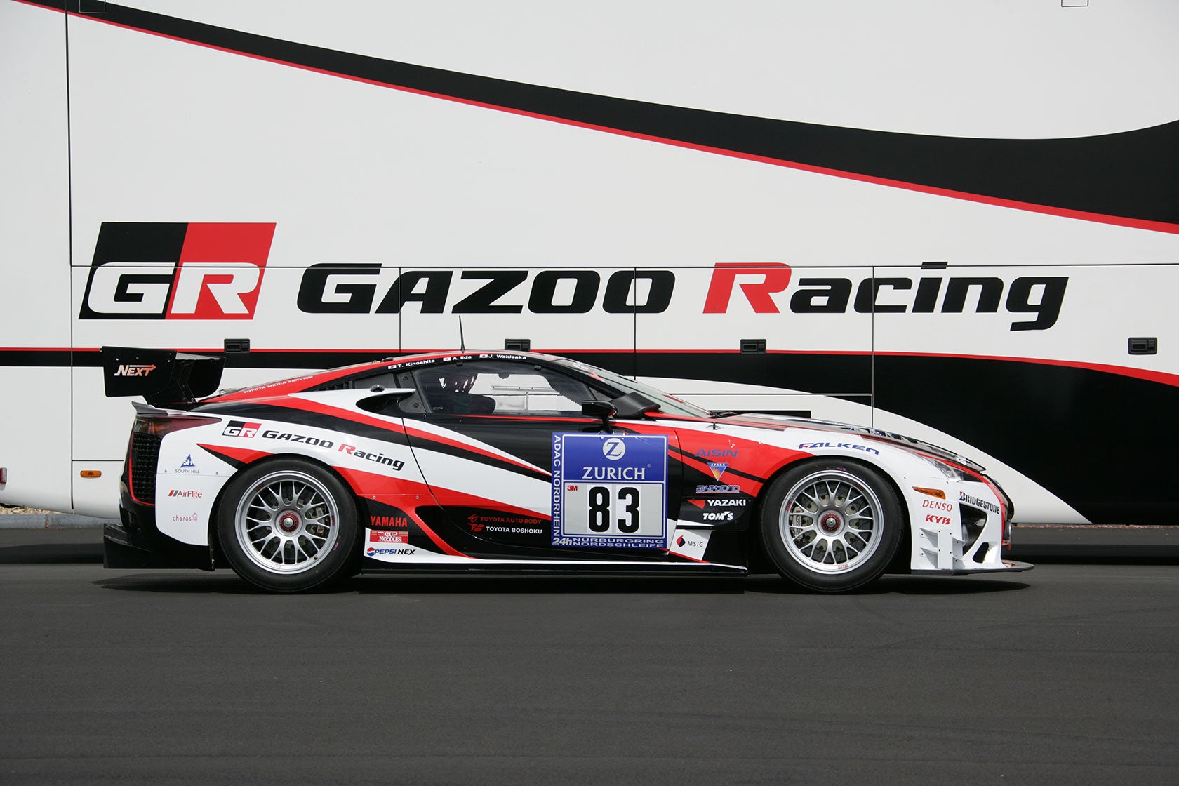
Long live Gazoo!
 LongbowMkII
> dailydoseofmindlessness
LongbowMkII
> dailydoseofmindlessness
02/04/2016 at 08:56 |
|
need. need. need.
 ReaperChief
> El Relámpago(LZone) - Humanity First!
ReaperChief
> El Relámpago(LZone) - Humanity First!
02/04/2016 at 10:31 |
|
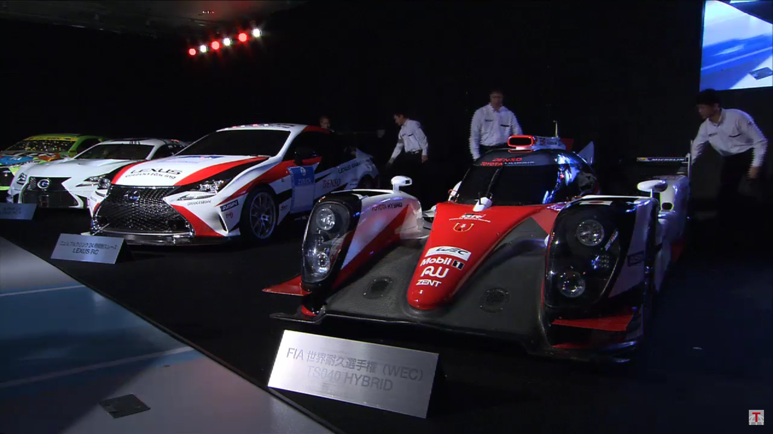
I think it’s good.. Toyota is more of a red and white kind of company.. If this was called a Lexus, then blue would have suited it more.. So, it’s also about perception of the brand..
 CALUSA
> El Relámpago(LZone) - Humanity First!
CALUSA
> El Relámpago(LZone) - Humanity First!
02/04/2016 at 11:51 |
|
I like it, nice wheels as well.